07/03/2024 Devlog - Bibi ready for action
Hellooo!
June came and went and we have a lot of new things to show you, so let us review what we've done over the month!

Changes:
- Health system rework - Reworked the health and stamina systems to use a slider instead of bars. The reason for that is because we couldn't have enemies deal different amounts of damage (since player only had 5 hp to begin with). Bars also made it hard to make a health upgrade system, since eventually they would just fill up the entire screen. But now HP can be freely increased without UI being mangled.
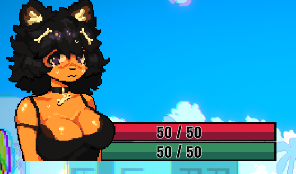
- UI Improvements - Speaking of UI, a lot of progress has been made on making it look better.
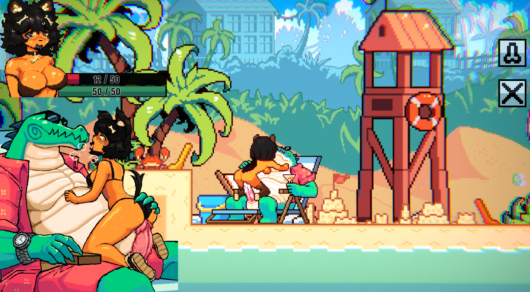
A lot of what used to be text is now represented by buttons, which takes a lot less space on the screen and isn't as straining on the eyes.
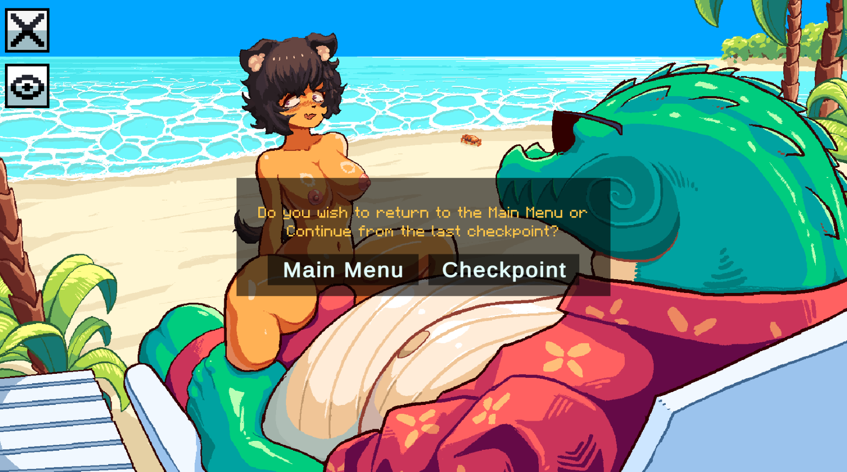
In the sex scenes, you now have an option to hide the dialogue box to see the whole picture. As requested, in the sex scenes and when you die, it asks you if you'd like to go straight back to the checkpoint or return to the main menu.
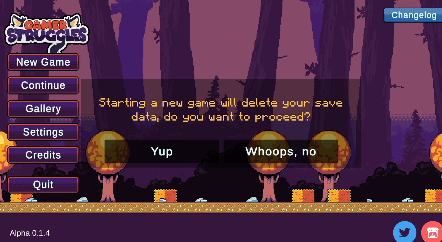
Protection against accidentally starting a new game and wiping your entire save data lol.
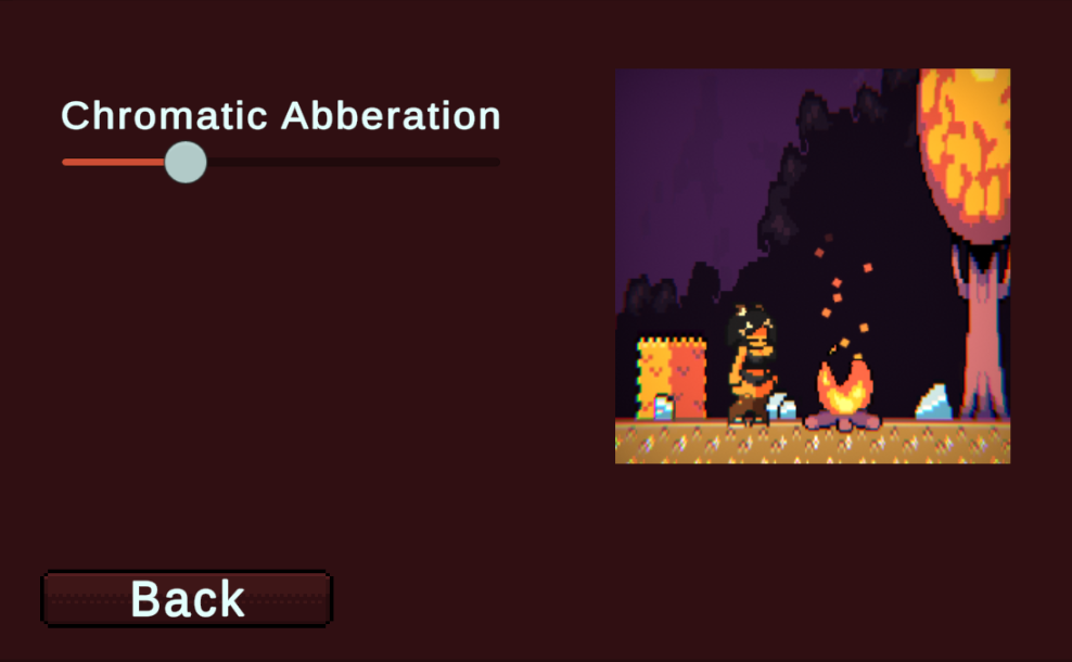
- Post-Processing settings - A lot of you felt like the chromatic abbreviation was a bit too much, so now we made a tab in the settings menu to customize it. So far its only chromatic abbreviation but we'll add more settings soon enough for you to play around with!
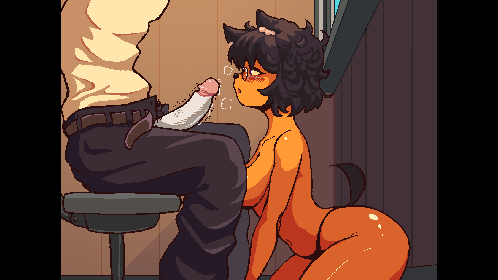
BJ Scene complete - Welcome to the juicy territory, the Fryman BJ scene is finished!
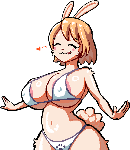
Bibi portraits - Bibi dialogue portraits. Both sex and normal animations are fully finished. Truly the greatest character we've cooked up
Level design - I've been working on expanding the villa area, populating it with new characters and dialogues. Additionally, new decorations for it are being worked on, as well as decorations to enhance previous rooms.
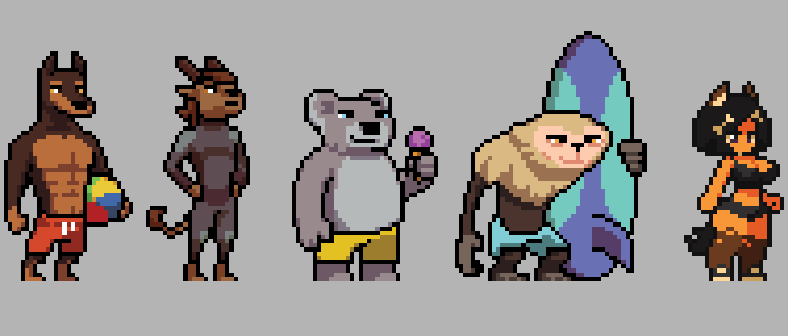
Location did feel quite empty for it to be a busy beach, so we are adding new background characters.
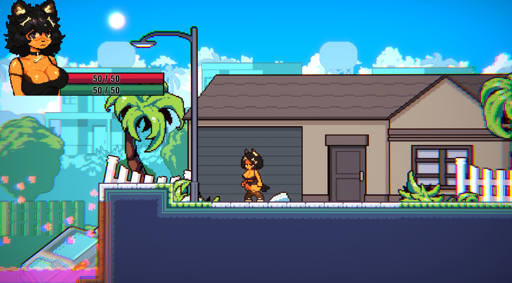
Villa area progress.
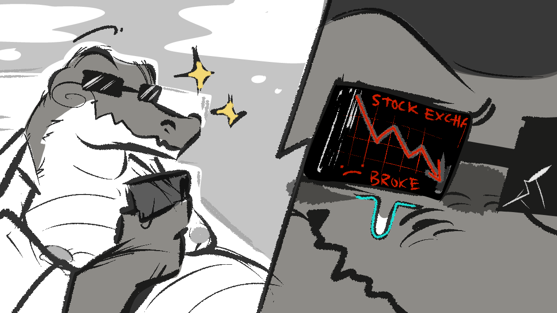
Aint gonna reveal everything, so thats it for today ;)
Until next update!
Get Gamer Struggles (NSFW)
Gamer Struggles (NSFW)
Very stinky
| Status | In development |
| Author | Cumbusters |
| Genre | Adventure |
| Tags | Adult, Anime, Cute, Female Protagonist, Furry, No AI, NSFW, Pixel Art, Side Scroller |
| Languages | English |
More posts
- Patreon Build: Gamer Struggles 0.1.8.38 days ago
- 15/09/2025 Devlog94 days ago
- Hotfix: Gamer Struggles 0.1.7.3Jul 23, 2025
- Patreon Build: Gamer Struggles 0.1.7.1Jul 02, 2025
- Patreon Build: Gamer Struggles 0.1.6.3Feb 14, 2025
- 12/24/2024 Devlog - Christmas time!Dec 26, 2024
- Hotfix: Gamer Struggles 0.1.5.3 & Android buildOct 12, 2024
- Public Build: Gamer Struggles 0.1.5.2Oct 02, 2024
- 08/16/2024 Devlog - Big overhaulsAug 16, 2024
- Patreon Build: Gamer Struggles 0.1.4Jul 13, 2024

Comments
Log in with itch.io to leave a comment.
Another benefit of being able to manipulate damage numbers more finely, is the possibility of easier hard mode implementation >:)
add price the game
go and not say that ever again
no, fokiu
any news on controller support?
I can bring it up to the team. The control style should work easily with it.
would make the game much more enjoyable to control since its platformer, thank you.
Give Bibi bigger ears. D:
The change to health makes sense but visually it is a downgrade, I'd consider other approached to it. For instance, instead of extending the bars as you gain more health you would change the color of them starting from the first bar. So when you took damage, the first bar would change back to red before damaging the bars as they did originally. In addition, you could have each bar represent more than 1 hp, having them partially empty when you take damage. Like this you could have 5 full red bars representing 50 hp. 1 blue bar followed by 4 red would represent 60 hp, and so on. If 1 damage is taken, 10% of a bar would break/disappear, 2 damage for 20%, etc. Probably much harder to implement, but would look better than the generic health bars.
I think just sticking with the simple 50hp bar as shown wouldn't be wise, or what they have in plans. epecially giving them the benefit of the doubt, if anything just making the bar more in style with the rest of the game and removing the numbers would go a long way
I know, I don't like it entirely either but for the sake of the game's mechanics, it is needed.
Plus we are talking about refactoring the UI.
wow, amaizng work!👍